BRAINTER PRO
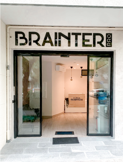
Brainter Pro Rehabilitation is a physiotherapy clinic with services ranging from standard lesion treatments to custom training applying new techniques, in order to avoid future health problems.
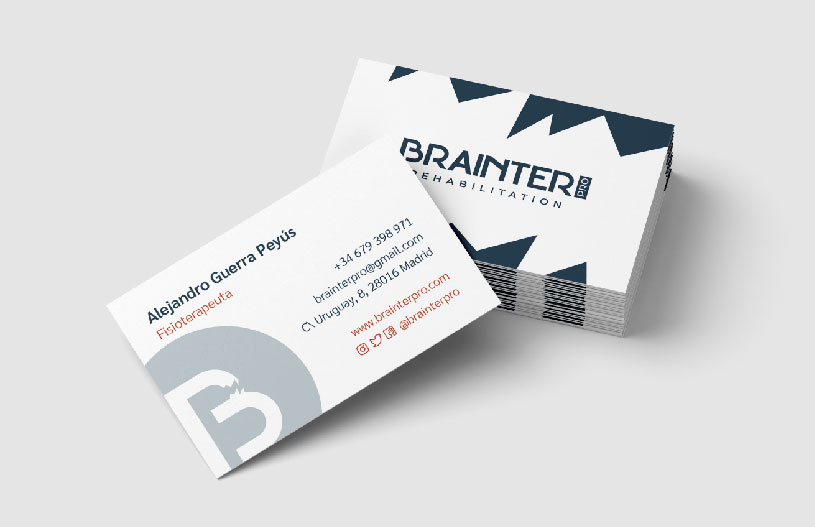
Young people as target clients require a modern visual identity and a responsive brand on social media, so a typographic logotype with a powerful icon was the ideal solution. To identify Brainter with the health and sports sectors, we establish blue and orange as corporate colours, which are commonly used in each area.
